Case Study:
Curated: The Companion Website
Curated was born from the frustration of users wanting to spend more time in the moment enjoying the artwork and less time searching for information on select artists and artwork.
The app also serves those who would like to reference select artworks at a later time while they are not physically in a museum or gallery.
The goal is the website is to serve as a companion to the Curated App, where users will be able to access their saved artworks and discover new ones on the site.
Designer Role
My role in this project was as both the UX Designer & UX Researcher, designing an app from conception to delivery.
The Problem
When gallery and museum goers take photos of art, there is no catalogue to access and no one space to find and access info on select pieces.
Project Goal
Provide a collection of saved artwork and reference info for users to access and interact with.
Target Audience
The primary user group found was museum and gallery goers alike, typically 18+. It was found to be useful to frequent visitors as well as casual visitors.
An additional user group is people who have difficulty finding information in a exhibition setting. We found that many users want to easily find and save information for later so they can be more present with the artwork.
Key Challenges
Finding information about artwork online can be difficult. There is no direct route to the information.
Gallery goers spent too much time trying to find information about various artworks in the space.
Research Study Details
Key details throughout the research proved to all be related to finding and accessing information.
Users are also frustrated that there isn’t a way to keep the information found after exiting.
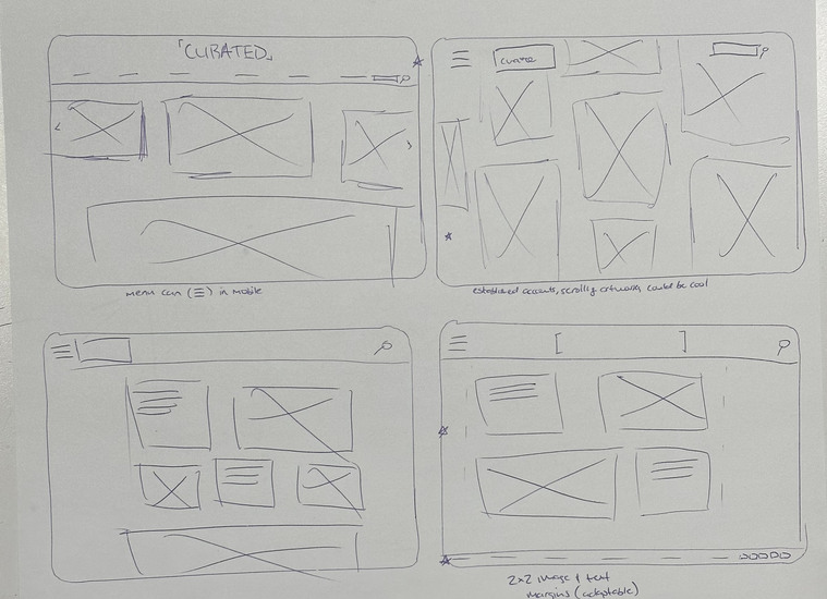
Initial Design Concepts
Similar to the mobile app, the priority was to focus on the home page, knowing that the header of the website would stay the same throughout. This was a good time for me to experiment with different layouts among the pages to see what looked and felt best, especially since this wouldn't be a carbon copy of the app, but more of a compliment to it.
Similar to the app, the goal was to set a homepage design since a similar design would be present throughout the rest of the website.
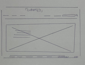
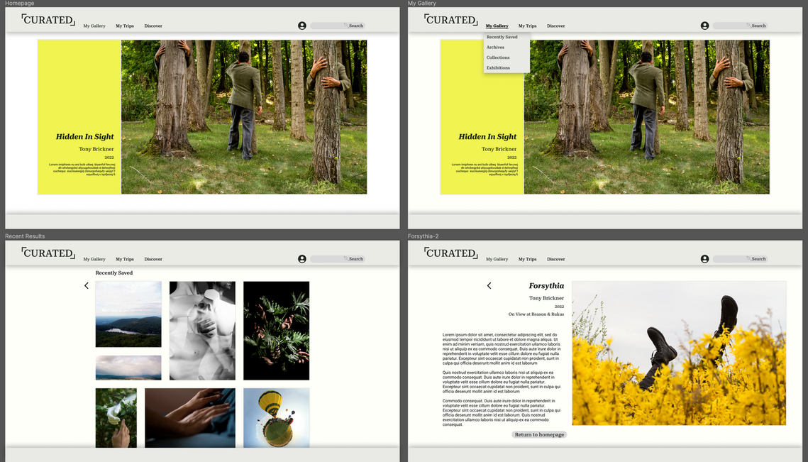
Final Homepage
This was the final design of the homepage before moving on to a digital wireframe of the site. It follows a similar structure and feel as the Curated App.
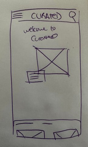
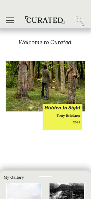
Mobile Version
Although there is already a Curated App, I figured if one was to go on the mobile version of the companion website, this is what it would look like if a user wasn't using the art identifier feature

The homepage of the site would focus on one image. It could either be from the users saved images or something the site curates for the user, depending on what they recently saved or what their interests are.
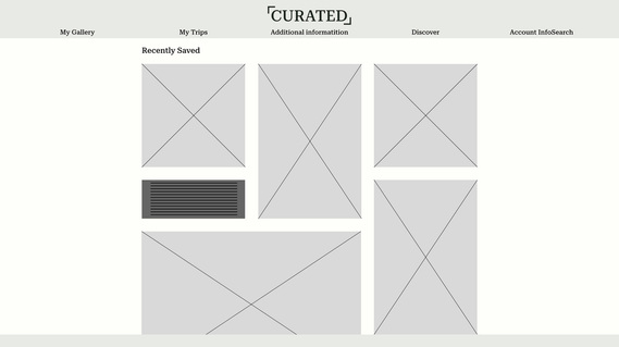
When searching for their artwork, the layout would be salon style, emphasizing that this is the curated collection of our user, and not of any museum or gallery.
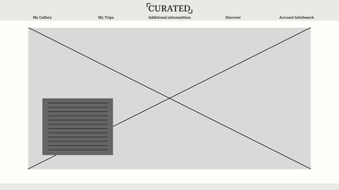
Beginning with this wireframe, I realized that the centered nature of the text made a site as simple as this one look cluttered. Also, while laying out the homepage, the layered box of text was a good idea in theory, but didn't look so great when being executed.
In these two high-fidelity versions of the homepage, it takes into account user feedback explained down below, as well as design considerations that make the user know exactly where they are within the site.
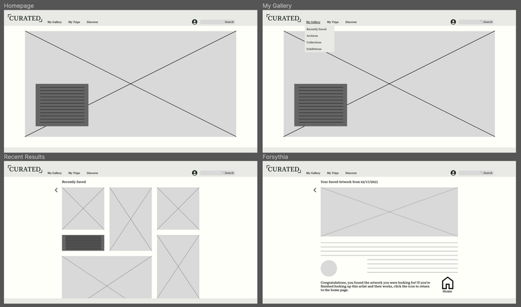
Low-fidelity Wireframe
For the most part, no major issues came up with the wireframes as they were. The ideas were clear and navigation was easy
User Testing
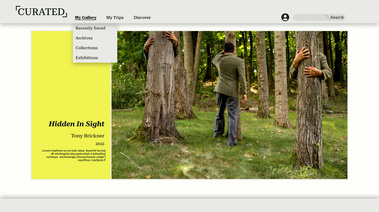
In the user testing phase of the process, it was found that the headline menu was too cluttered spaced out and centered. Also, the “Search” word and account take up space and are too close together. They add to the headline clutter.
This is why in these revisions they are aligned to the left, while the account icon and search function are both aligned right. This leaves room for additional features to be added as needed.
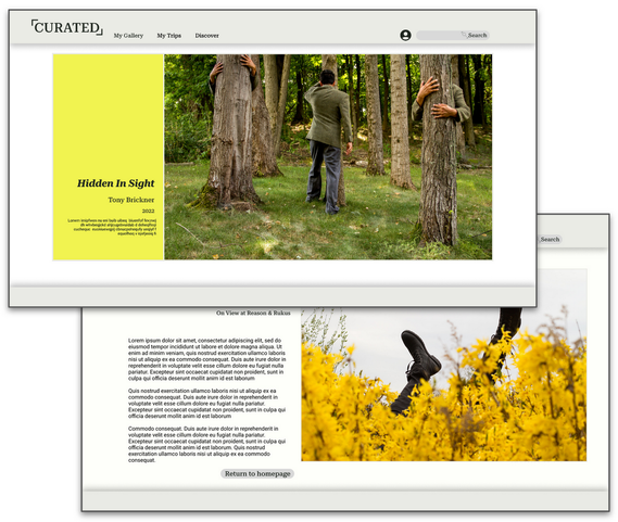
Final Mock Ups for Curated: The Website Companion
Takeaways
In creating this website that is a companion piece to the app, it made me realize that there is a place for something like this. As I continued with the design, I’ve come to find that just because the focus is on the artwork, it doesn’t mean that you can’t have a great backdrop to showcase the work.
Throughout the project, I learned that sometimes you have to stick to your guns. Had I not believed in my design at the low-fidelity stage based on some feedback, I wouldn’t have gotten this end result. I’m very receptive to criticism and love feedback, but I like this program said earlier, you don’t need to implement every bit of feedback in critique.
Next Steps
Continue to make additional info pages for every artwork in the collection.
Experiment with implementing more color into the website overall. It’s important to keep it neutral to showcase the work, but some additional tones might be good.
Add in a filtering option for saved works.