Case Study:
Career Shift
Career Shift is a concept born from my own frustrations as someone wanting to change direction. The idea is to be a resource, using your working experience and interests to figure out what might be the best pivot for you.
Deciding to switch careers is a big decision, especially when a user has been where they are for an extended period of time But, Career Shift seeks to help those out who want and need it by providing guidance to which pivot may be best, low ost ways to get there, and resources to help users out whenever they need it.

Designer Role
My role in this project was as both the UX Designer & UX Researcher, designing an app from conception to delivery.
The Problem
Users want to change the course of their careers or enter back into the workforce. The problem is that there isn’t a resource for that. Most feel lost or stuck, thinking they have nowhere to go, or they may not want to invest the time and money into something they may not like long term.
Project Goal
The goal is to make a career shift not as daunting as it may seem. The goal is to create a supportive environment where users feel like their options are limitless instead of feeling limited.
Target Audience
The primary user group was not first time job seekers, but those where are seeking to either pivot their career path or those looking to reenter the workforce.
Within that user group is people who feel stuck or trapped in their current roles. Many users are very unsure of where to go and when it comes to career changes, they aren’t too optimistic. This app and website seeks to change that.
Key Challenges
Deciding to shift careers, especially in a technology focused world can be daunting, so it's important to keep the design user focused and user friendly.
An additional challenge is keeping the navigation simple but engaging a the same time, so users don't give up quickly.
Research Study Details
Key details through the research proved that there is a use for an app like this.
Users want to try different careers without having to spend their resources (time and money) when they may be limited.
Initial Design Concepts
With most of my designs, I focus on various points of navigation, knowing that one will always inform the other. During the design conception, I wanted it to be simple and straight forward design, where users knew exactly what to do. I wanted there to be mostly icons and minimal text.
With this design, I also knew I wanted the color scheme to be reminiscent of a notebook, using pale blue and red colors, along with white. I gravitated toward this color scheme because I wanted the user to feel less intimidated by the prospect of learning something new, and to signify that it's more than okay to be doing so.
Also the colors appeal to me and make learning a little more fun.
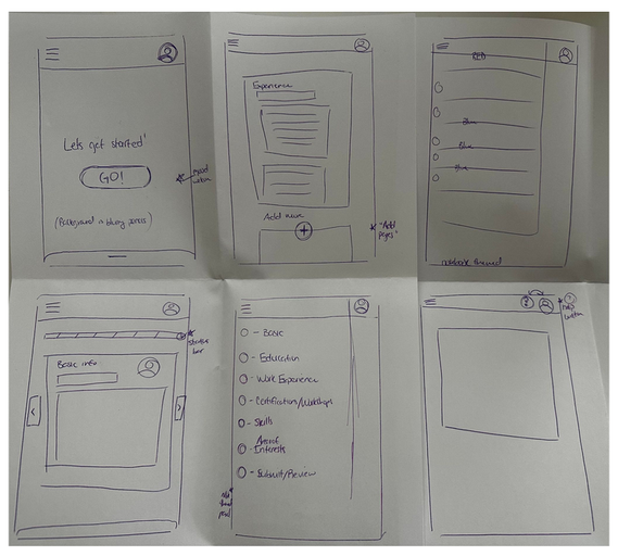

Low-Fidelity Wireframes
With these wire frames, I was able to get a good sense of what topics I wanted included on each page of the mobile app
User Testing
Users noted that the button icons were deemed too big, which took up valuable space on the screen
Users weren’t too trustworthy of the app as they progressed on. There was no indication of information being saved on the user journey.
Users found that the layout was too simple, and there was no hierarchy indicating levels of importance.

In transitioning from low-fidelity to high-fidelity, there were issues with the buttons and their placement, as well as there being no text to signify if work was being saved
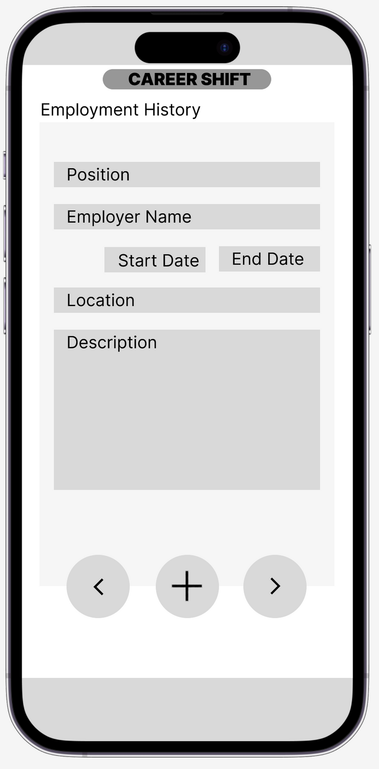
Another issue was hierarchy. Every element held the same weight. Even though I wanted to keep the design simple. there is such as too simple
Here in the high-fidelity mock up, buttons are placed at the bottom with words of confirmation. I decided to combine both screens into one, while also doing away with the symbols and adding text instead.
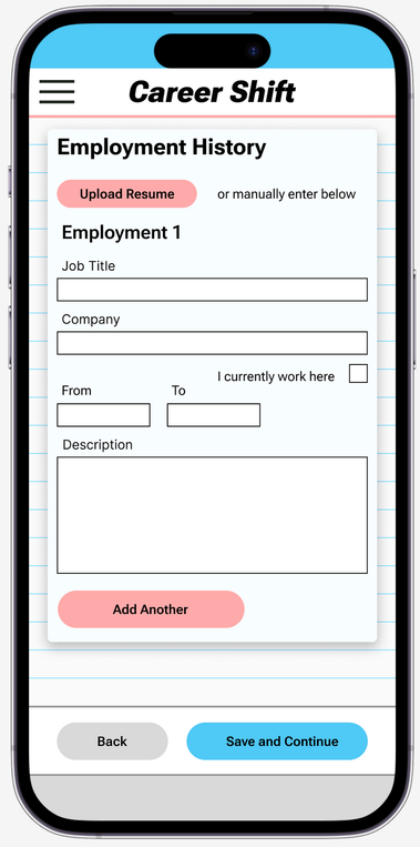
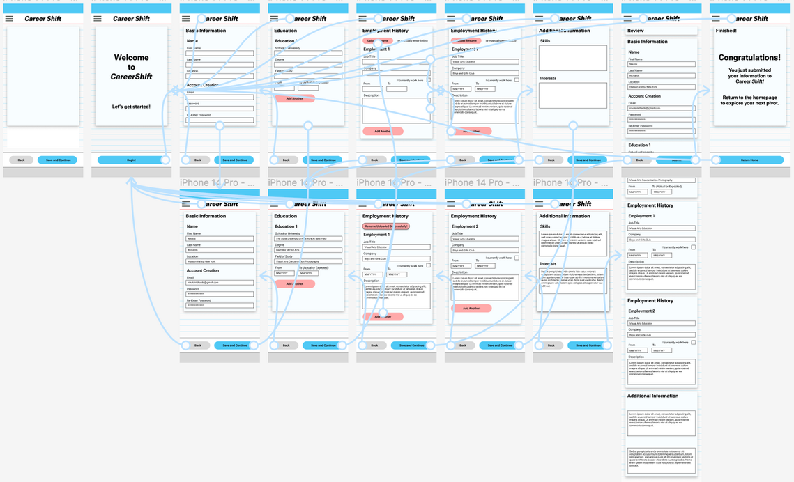
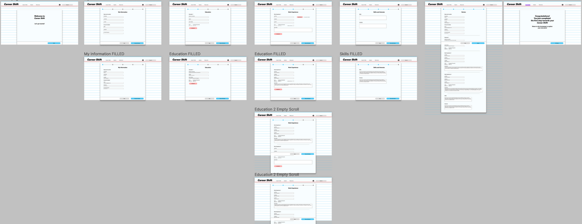
Final Mock Ups and Prototype for Career Shift
Web Version of Career Shift
Takeaways
In creating this concept, I realized that there are so many people that feel stuck in their roles, whether it be strictly work related or with life in general. If people can get even the smallest leg up, they are just a bit closer to their goals, and that’s what this concept wants to achieve.
I learned that there is a fine line between simple and too simple. Simplicity and minimalism is great, clean, and east to follow. But too simple can be bland and disengage users, no matter how helpful the consent is or how good the resource is.
Next Steps
Focus on engaging language. I’ve experimented with different formats with how to title certain sections, but next steps would be what language to use that would feel most inclusive.
Work on the framework for the remainder of the website. By doing this, it’ll further guide the direction the website takes.
Expand on additional information that may be useful for the career profile. The basics were covered as they would be for any job application website. But this site is determined to be more than that.